
Minimalism
Keep composition sparse and legible. Every plane, seam, and accent must earn its place.
Tactile minimalism for a soft future.
A design language combining matte paper materiality, sharp origami geometry, muted blue and orange accents, and restrained sci-fi atmosphere.
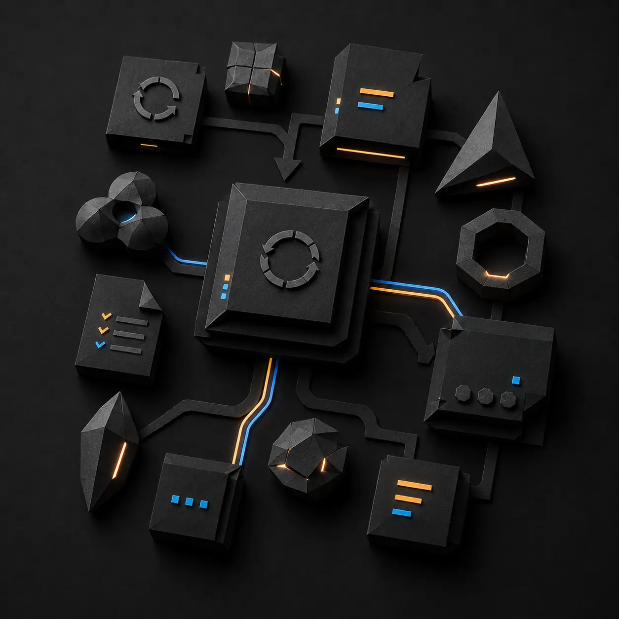
PaperTech is built around the tactile pleasure of premium paper. Deep gray surfaces, quiet color, crisp folds, and calm lighting make digital interfaces feel physically present without becoming ornamental.
PaperTech gives digital systems the physical presence of premium folded paper: minimal, tactile, and quietly futuristic. Every visual decision should reinforce material, structure, or interaction.
Keep composition sparse and legible. Every plane, seam, and accent must earn its place.
Use paper grain, folds, creases, edge tension, and controlled shadow to make surfaces feel physically present.
Suggest advanced technology through restraint, precision, and quiet light rather than dense decoration.
Charcoal paper does the structural work. Color is signal, never wallpaper.
#111111Foundation#222222Primary surface#333333Raised plane#0095E3Action and state#FF9B00Focus and energyLarge angular folded containers that organize content, establish hierarchy, and give an interface its physical structure.
Small interactive shards and markers used for controls, state, feedback, and moments of concentrated color.
Planes, creases, cut edges, and shadows that communicate hierarchy without relying on conventional card borders.
Restrained lines of light or color that reveal relationship, flow, focus, or active state.
PaperTech explores a middle ground between sterile flat minimalism and highly decorated futuristic UI: minimal interfaces with material presence and soft physicality.
Resist Design works on product architecture, prototypes, production applications, design systems, and the infrastructure that holds them together.
Start a conversation